Booking flow
Making enquiries easier


User Flow
Booking the Service
ideation of the website
Jobs To Be Done (JTBD) When I plan to book the Dabbawala service, I want to quickly understand how the service and process work, and book it easily, so that I can start using the service with confidence and without confusion.


Logo sizes


Efficiency
Reliability
Structured
Friendliness
Human Connection

Logo Concept
The logo is based on the idea of simplifying a complex system. The Dabbawala network works through coordination, movement, and human connection, so I translated that into a clean, structured visual form using simple geometric shapes. The aim was to make it feel clear, reliable, and easy to recognise, while still keeping the essence of the original system.
Key Design Gaps
Unclear service explanation
Poor information structure
Weak user flow
Lacks visual hierarchy
Limited accessibility for new users
Not aligned with modern digital expectations
Existing Website Analysis

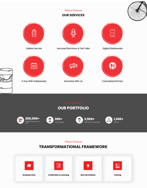


Low readability
The logo becomes unclear at smaller sizes
Outdated visual style
Does not align with current digital platforms
Limited visual consistency
Not adaptable for a wider brand system
No clear system representation
The efficiency and structure of the service is not visually expressed
Lack of scalability
Difficult to use across different applications
Key Design Gaps
Existing Logo Analysis


THE PROBLEM
The Mumbai Dabbawala Association operates through a highly efficient system built on traditional practices and a unique coding method. However, this system remains largely undocumented visually, while its existing visual identity and website don't fully communicate the organisation and reliability behind the service. As a result, new users may struggle to understand how the service works and how to access it.
THE OPPORTUNITY
The opportunity was to make the Dabbawala system easier to understand through a clearer visual identity, better documentation of its unique coding method, and a more accessible website. By bringing these elements together, the project aims to bridge the gap between the efficiency of the service and how people experience and understand it.

MY DESIGN APPROACH
I approached the project through two key areas: redesigning the visual identity to reflect the reliability and organised nature of the Dabbawala network, and rethinking the website to make the service easier to understand and access. I also explored how the unique coding system could be communicated more clearly through visual design.